2020 was a lot of things but in the world of home décor it saw people moving out of cities into houses, rearranging living areas into work/live spaces, or painting walls for a change in scenery. It is always interesting to see the colour predictions for the year put out by paint companies but this year more than any other, we are all looking for that fresh start and to leave the last year behind us. And while a fresh coat of paint will not fix everything, the restorative blues and warm jewel tones of this year’s colours have the potential to add some much-needed harmony to our homes.
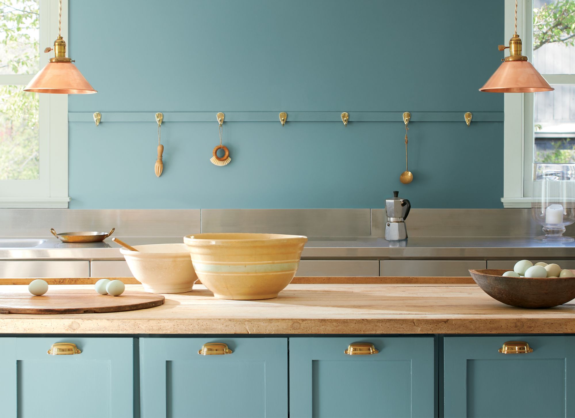
Benjamin Moore’s colour of the year, Aegean Teal 2136-40 described as a “balanced, soothing hue that creates natural harmony.” The rest of the palette follows suit with cozy colours such as Gray Cashmere and Foggy Morning. Even the more colourful swatches are softened into warm terracottas and dusty purples, and unoffensive yellows.
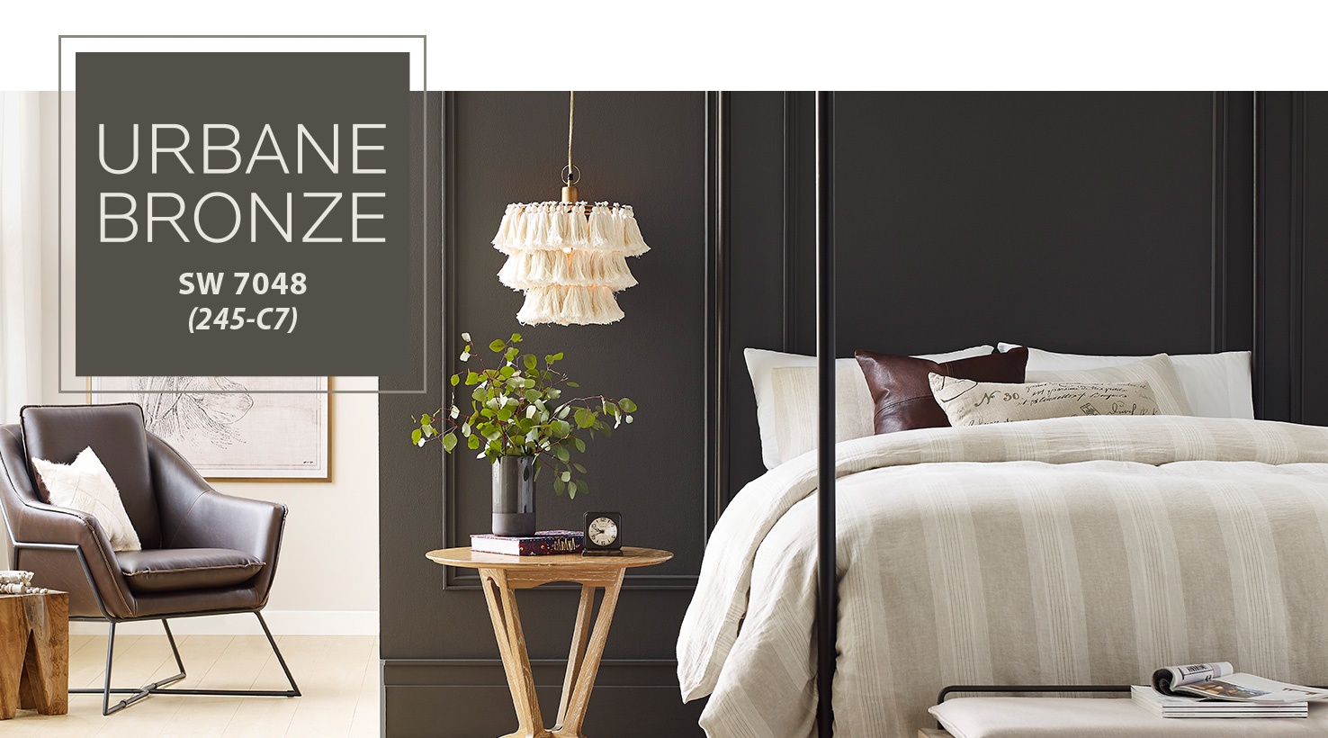
Sherwin Williams chose a dark reassuring gray with its Urbane Bronze SW 7048. A unifying colour aimed at “embodying the richness of the Earth’s stone, metal and wood.” It is a gray that is both strong and comforting. I could see it in a cozy den or making a statement in a bright room.
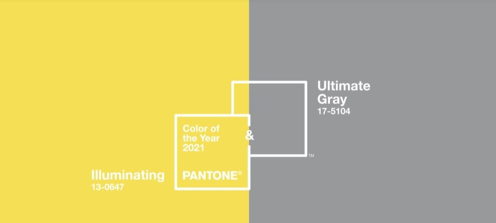
Pantone, for only second time in 22 years has chosen two colours for its colour(s) of the year. PANTONE 17-5104 Ultimate Gray and PANTONE 13-0647 Illuminating. Pantone described the chosen yellow and gray as “a marriage of color conveying a message of strength and hopefulness that is both enduring and uplifting.” It is juxtaposition of colours that might just set the tone of the next year as one of strength and optimism.
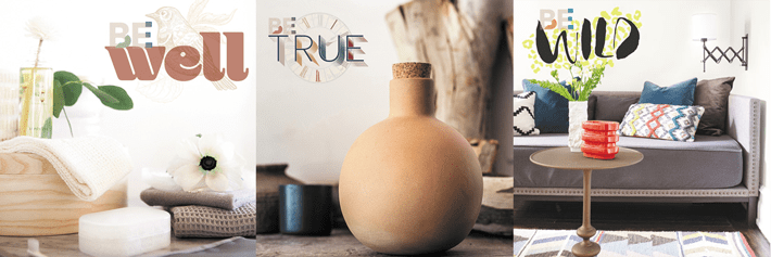
Dulux has also put out colours chosen by their experts to “bring warm lightness and a sense of calm to a space” with their Be Well palette comprised of restorative blues and pinks. Joining the Be Well palette is the Be True palette that goes deeper into jewel tones balanced out with earthier hues as well as their Be Wild palette which is an energetic combination of brighter colours perfect for adding some playfulness into a room.
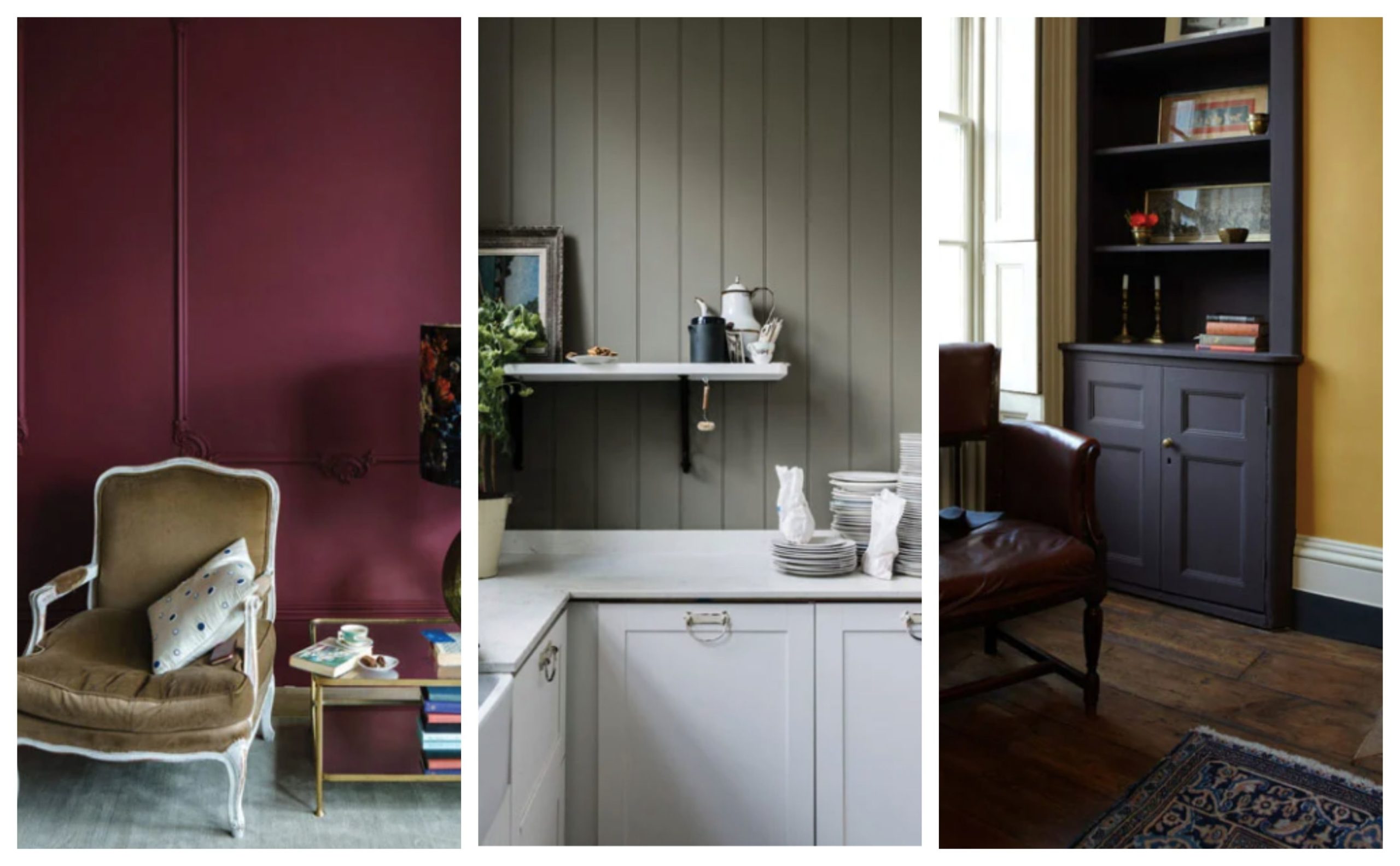
Behr gave us similar palettes of light warm neutrals, restorative blues and greens, soft gentle hues of pinks, and rich evocative darker colours. Farrow and Ball follows suit with their selection of three warm, rich earthy tones.
There is something for everyone with this years paint predictions. Whether you are looking to make your home a serene spot to restore, a deep cozy space, or add in brighter colours to lift ones mood. What colours are your favourite? Do you have a room that needs a refresh? We are available for design consultations. Just send us an email!

