Today I am going to share with you some of my favorite Benjamin Moore paint colours that I have used. These are colours that have been used for years by many designers, because they are so great!
#1 – cloud white, OC 130
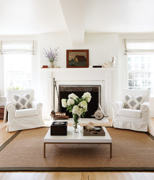
photo: houseandhome.com
This has been one of my favorite whites for many years. It is a soft, creamy white that goes well with white subway tiles and can be used in any room. It is also great for trim. Most of my house is painted this colour and I never grow tired of it. The only rooms I don’t have painted cloud white are my bathrooms – I like a little colour in those rooms. If cloud white is not white enough for you, simply white OC 117 is also great.
#2 – wickam grey, HC 171
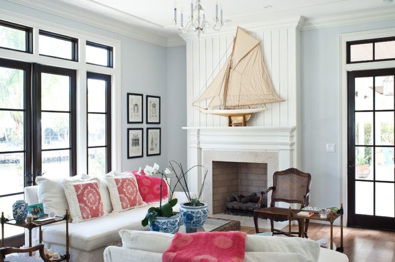
photo: houseandlivingdecor.com
This is a soft grey, that looks great in almost any room. I have used it in bedrooms, living rooms, and recreation rooms.
#3 – eternity, AF 695
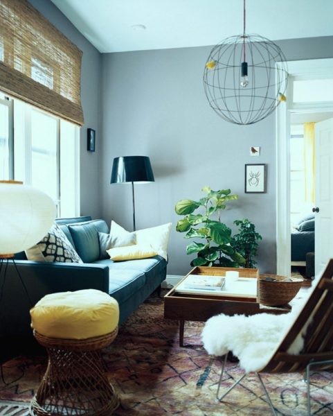
photo: domino magazine
Slightly darker than wickam grey, with a little more blue in it, this colour goes well with carrera marble. I have it in my master bathroom and just love it. This is a low VOC paint.
#4 – platinum grey, PM 7
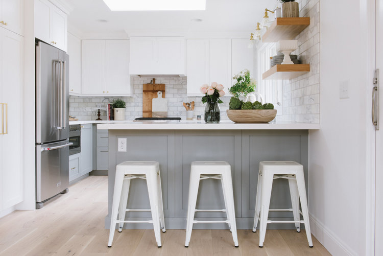
photo: studio-mcgee.com
Darker than wickam gray, this gray looks great on kitchen and bathroom cabinets.
#5 – revere pewter, HC 172
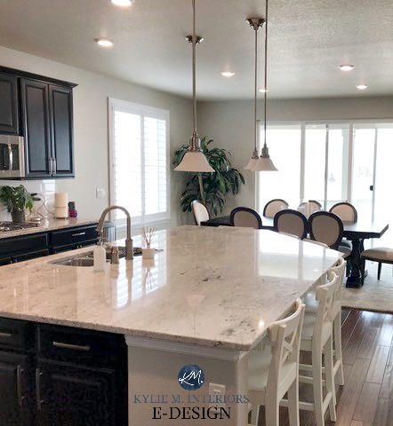
photo: kylieminteriors.ca
Another soft, neutral colour that is a sophisticated classic. It is a soft beige with just enough colour in it that it doesn’t look washed out. It tends to look quite different in different lights, so make sure you paint a sample first.
Dark Paint Colours
A few dark paint colours stand out for me, for using on accent walls, or kitchen and bathroom cabinets –
#6 – hale navy, HC 154
photo: theharperhouse.com
I have this dark, rich blue on my island and just love it. Another benjamin moore colour that has been around for a long time and continues to be used alot.
#7 – kendall charcoal, HC 166
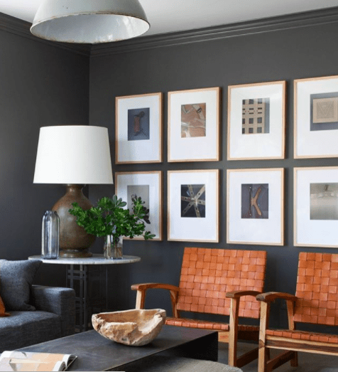
photo: BHDM design
This is a very dark gray with a bit of brown in it. I recently used it on an accent wall in a client’s “man cave” and it looked spectacular.
#8 – fatigue green, 2140-10
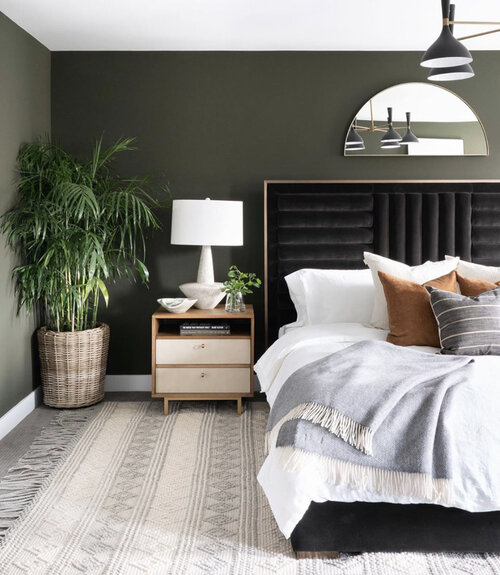
photo: leclairdecor.com
A beautiful, very dark army green that adds drama to any room.
#9 – mediterranean teal, 2123-10
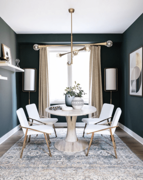
phto: leclairdecor.com
Another very rich, dramatic colour, this is a dark blue-green.
#10 – wrought iron, 2124-10
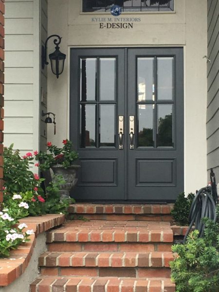
This is a very dark grey that is almost black – great for cabinets, doors and accent walls.
Have you used any of these colours in your home?