by Nikki MacCallum
Countries like Morocco, Central Asia, China and Russia are all influencing the colour trends for 2010. The patterns in the fabrics and the ways the colours are combined are a direct reflection of the cultures of these countries.
Pantone has chosen turqouise as the colour of the year. It’s vivid, bright tones create a feeling of hope. Turqouise, in many countries, is believed to be a colour of faith and truth. Inspired by water and sky, it inspires deep compassion and feeling. Visit this website for some great examples of turqouise in home decor: House of Turqouise
Coral is also a very popular colour for 2010. This soft orange colour is very versatile and easy to pair with other colours like brown, purple, turqouise, white or ivory. It is best used in good light conditions and looks great on large pieces like rugs and furniture.


Purple is another colour that will be seen this year. Rich plums and vibrant violets inspire romance and individuality.


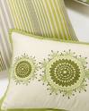
Eco-friendly decorating and design also have an impact on colour trends. Organic products often contain no chemical dyes and are therefore neutral in colour. These earth tones mix well with the global tones. For example, browns and greens and other neutrals will be combined with pinks, blues, yellows and purples.


